Hyphn

Interior and exterior meld into a customer arrival area.

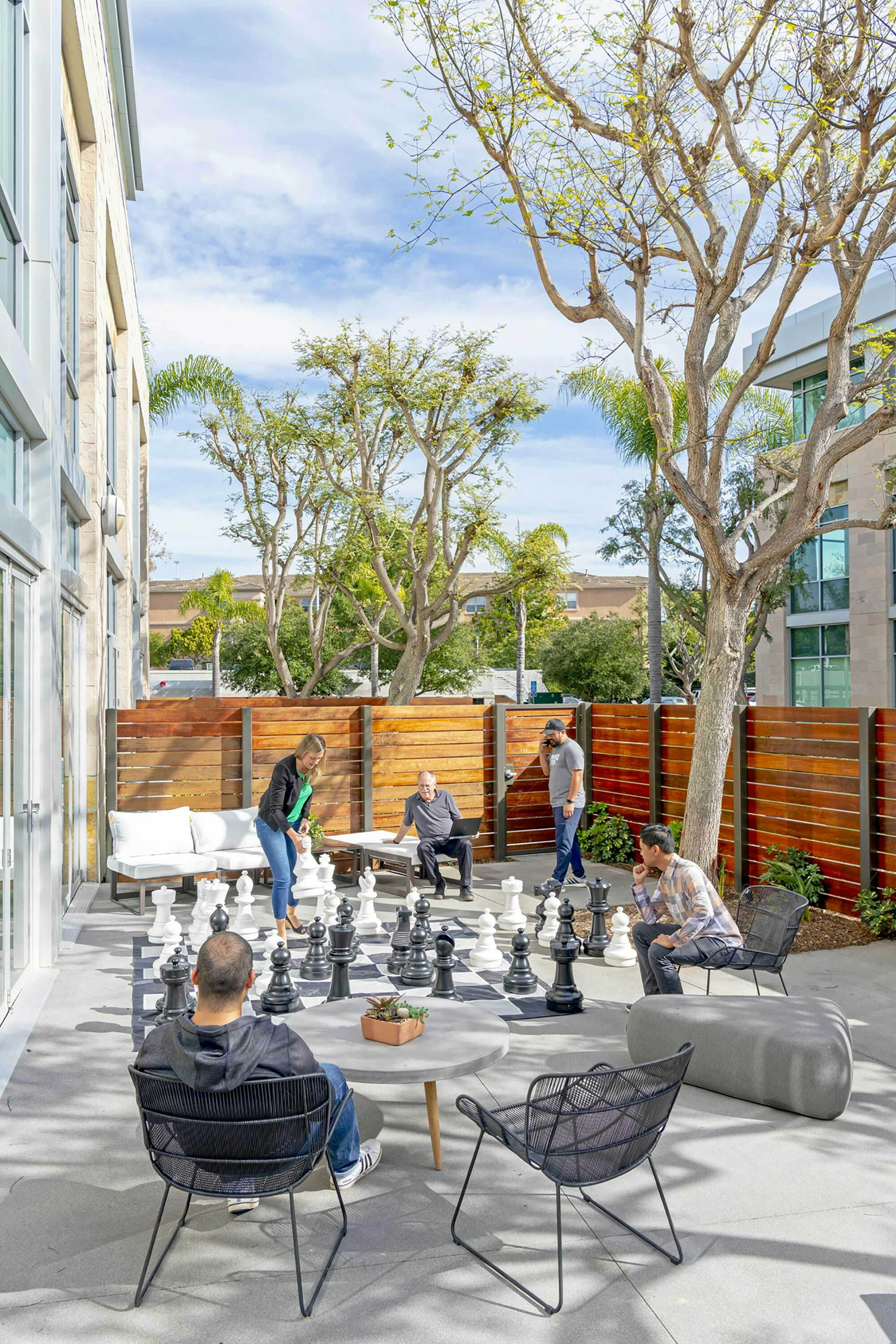
All spaces support team work.

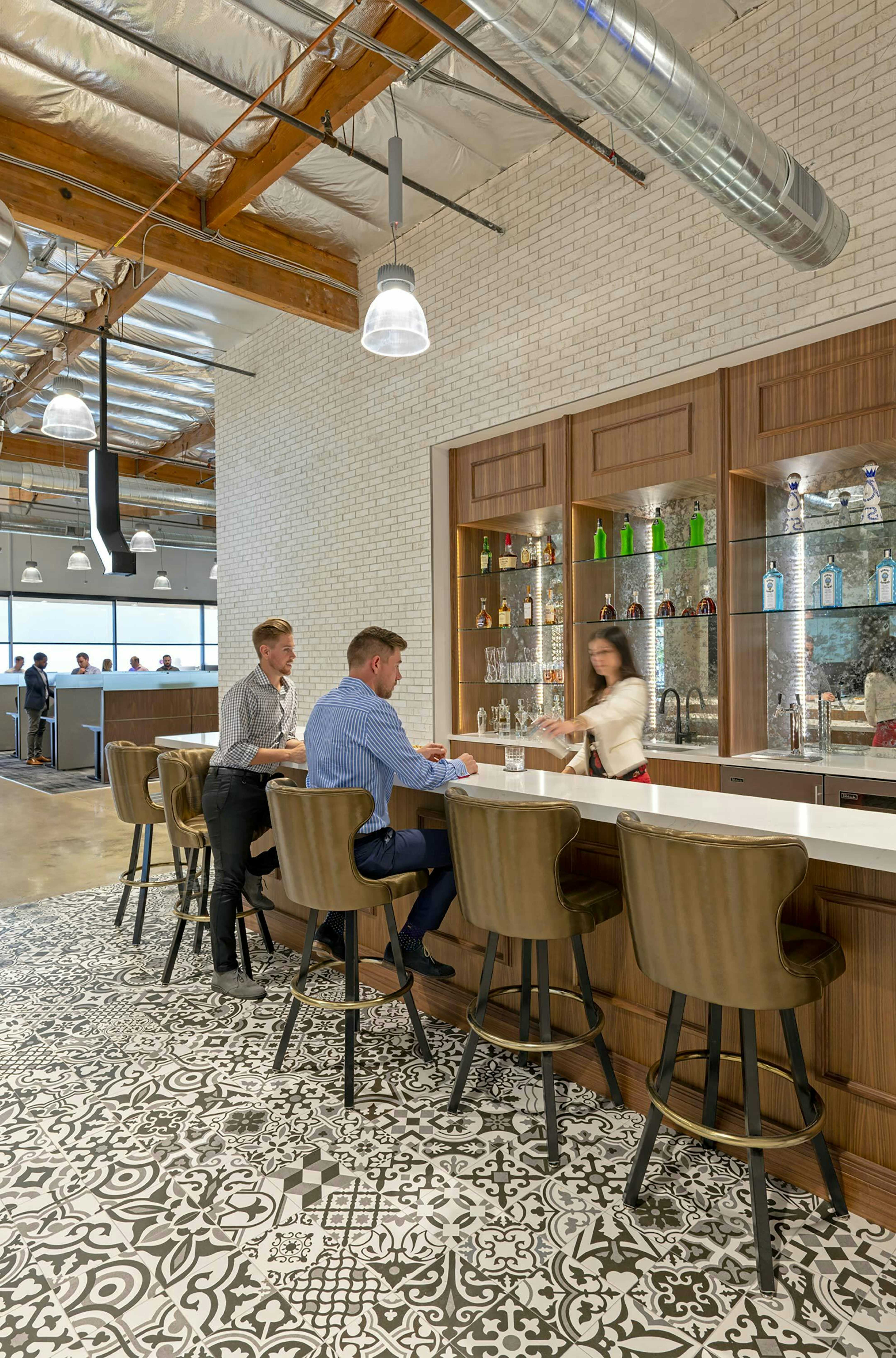
The bar replaces the boardroom.

Full presentation capabilities at the bar supports formal meetings.

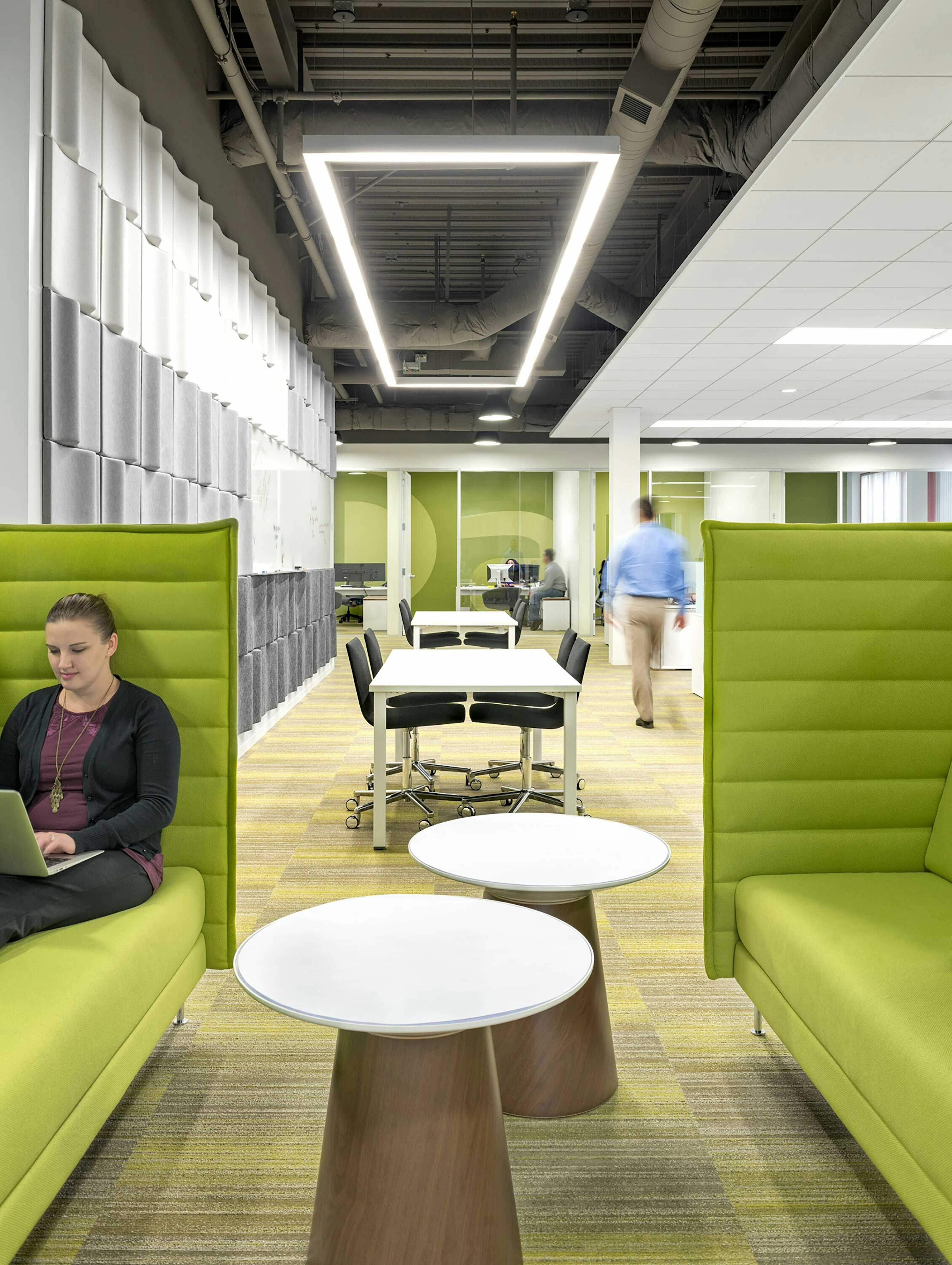
Neighborhoods foster natural interactions

Intuitive audio-visual tools enabling seamless, equitable participation from anywhere.

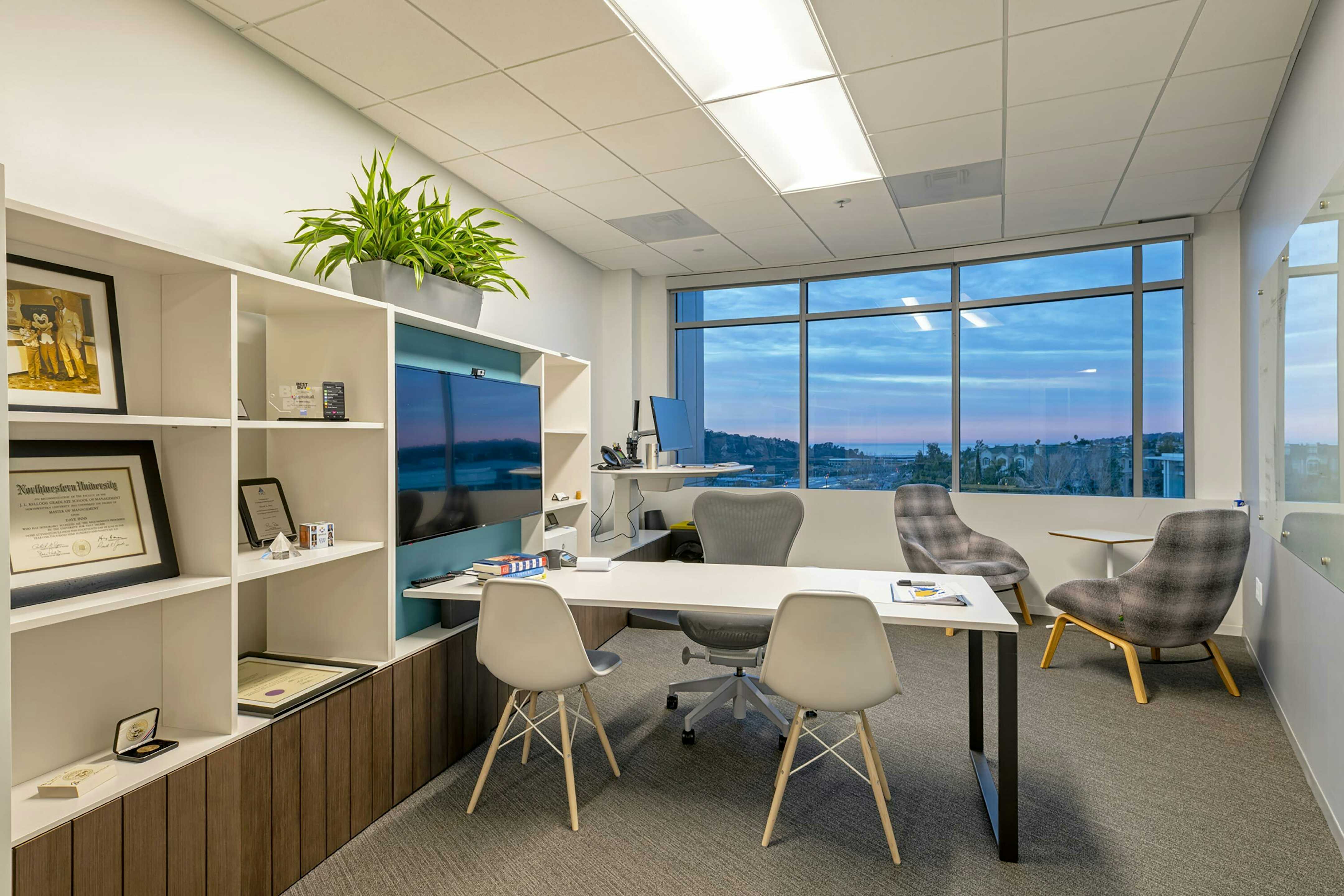
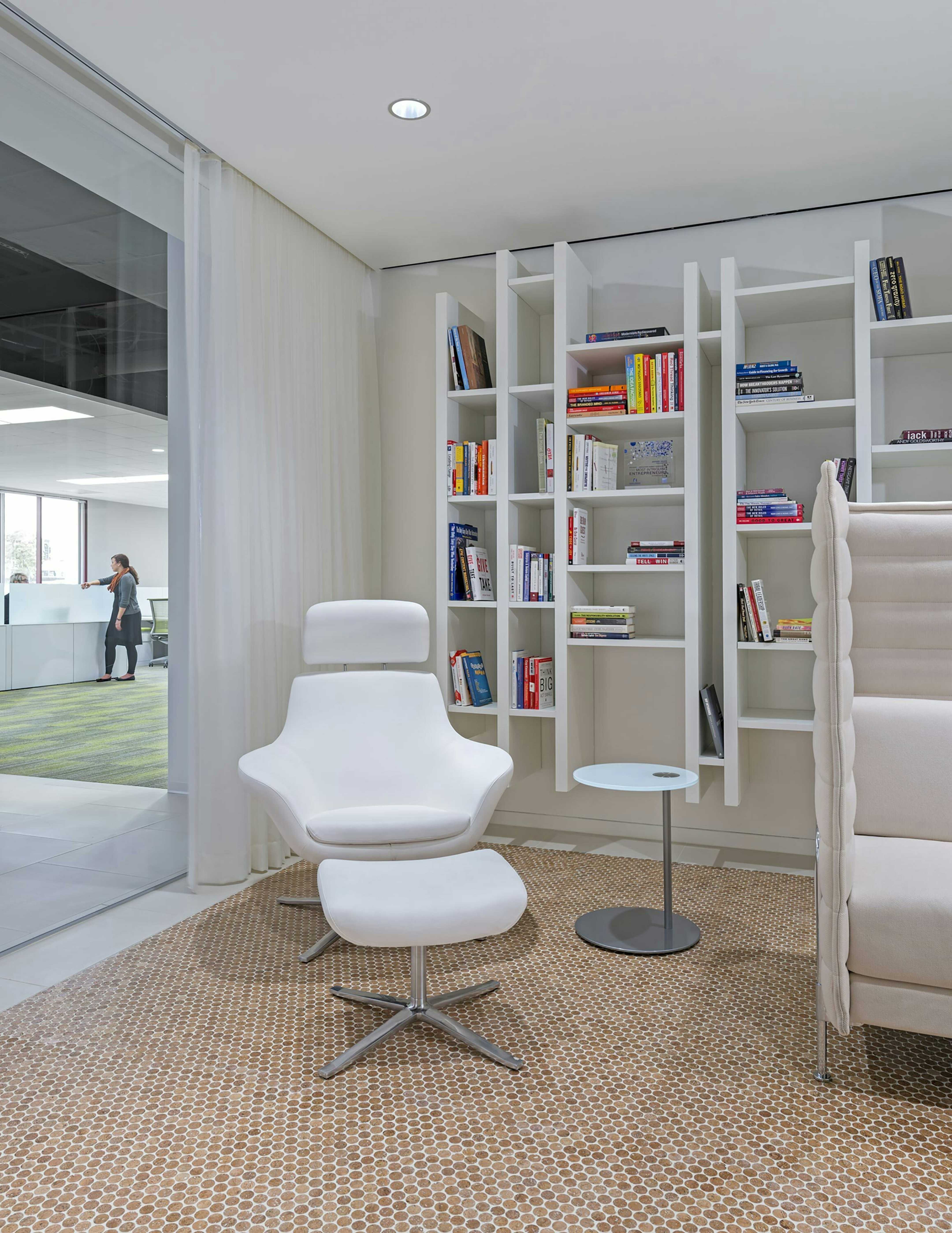
Exciting small spaces support private phone calls and virtual meetings.

Exciting small spaces support focused work.
Hyphn
“Traffic sucks. My coworkers aren’t here, and those who are distract me,” one team member said as we began collaborating. While being together has clear benefits, the effort often feels too high unless the workplace truly inspires us.
The Hyphn experience does just that, building community, reflecting culture, and modeling human-centered design. It rejects the typical corporate feel while maintaining strong business performance. The project’s success lies in balancing these opposites.
The central hearth is a pantry designed as a bar — coffee and pastries in the morning, beer and charcuterie by night. Food, conversation, and music bring people together with full presentation technology when formal meetings are necessary.
Diverse workstations showcase multiple configurations and finishes, arranged into “neighborhoods” that foster natural interaction. Materials, lighting and accessories feel comfortable and authentic.
Integrated technology enhances collaboration across all zones, with intuitive audio-visual tools enabling seamless, equitable participation from anywhere. Wireless conferencing and digital tools make transitions between remote and in-person work effortless, strengthening connection, culture, and decisions.
This marks the third generation of showroom experiences developed by our team, with the client’s business more than doubling after each iteration. The success reflects a deep, strategic partnership built on mutual trust and respect for each other’s expertise.

Shade structure inspired by the lotus flower.

Event lawn can be viewed from the entire campus.

A bold statement at the campus entry.

Hydraulic operable walls connect the interior to the courtyard.

Lawns transform from sports during the day to events in the evening.

Timber materials blend with the natural environment that was created.

Brand details everywhere.

Parking was reworked to allow the creation of a new garden space between three buildings.
What began as a modest installation of new workstations has, over five years, evolved into a full-scale transformation of Aya Healthcare’s campus. Spanning three buildings and the outdoor spaces that connect them, the reimagined campus reflects Aya Healthcare’s commitment to fostering a vibrant, people-centric work environment. In a competitive industry where talent is key, their dynamic office and revitalized courtyard provide an inspiring space that supports both productivity and well-being.
Aya Healthcare specializes in recruiting, accrediting, and placing traveling nurses in hospitals across the country. Their recruiters weave complex networks, matching nurses’ skills with the right hospital placements. This intricate process is visually represented through a bold, sculptural installation of orange ropes stretching across walls and ceilings — each rope symbolizing a nurse, and each intersection representing a successful placement. The design captures the energy, dedication, and impact of Aya Healthcare’s work in a striking, immersive way.
Outside, the transformation continues with a courtyard that replaces former parking and roadways with a sculptural green space. Designed for gathering, relaxation, and large-scale presentations, the courtyard offers a healthy, restorative retreat for employees. Inspired by the life cycle of the lotus flower, three shade structures symbolize its stages — bud, bloom, and seed pod — creating dynamic focal points within the landscape. The spaces between are filled with native plants, offering a variety of settings for sun, shade, group collaboration, and quiet reflection.
The new Aya Healthcare campus is more than an office — it’s an ecosystem designed to inspire, connect, and support the people who make their mission possible.

Materials and views welcome private clients to this bank.

Views extend along the entire length of the space.

Views extend along the entire length of the space.

Rich and rough materials combine with stylish details in this conference room.

Daylight, views and connection for all.

All utilities are coordinated out of view.

Espresso, wine and snacks are always handy.

Glass office fronts allow light to penetrate into interior work areas.
This private bank sought a space that seamlessly blended sophistication, warmth, and functionality. Drawn to our work for its refined aesthetic, the client envisioned an environment that would feel both inviting and elegant for staff and customers alike. Our design approach embraced a spectrum of space types, ranging from formal meeting areas to relaxed gathering spaces, creating a balanced atmosphere of professionalism and comfort.
The chosen building, with its striking concrete structure and abundant natural light, provided an ideal foundation for the client’s vision. Rather than treating the exposed concrete as a purely industrial element, we elevated it as a defining luxury feature. The ceilings were carefully cleaned and illuminated to enhance their texture and natural color variation, while utility lines were meticulously curated or concealed to maintain a refined aesthetic.
To contrast the raw beauty of the concrete, we introduced a material palette rich in warmth and texture with luxurious wood veneers, natural stone and an abundance of greenery. The result is a space that feels tactile and inviting, where the interplay of rough and polished materials creates depth and character.
The layout prioritizes both privacy and connectivity. Workspaces along the perimeter benefit from daylight and expansive views, while interior offices provide a sense of privacy without compromising the flow of light. At the heart of the design, an open break area serves as a casual gathering space, fostering interaction between staff and clients in a relaxed, welcoming setting.
This project redefines the conventional open-to-structure approach, elevating raw materials with a curated, sophisticated touch, delivering a private banking experience that is as refined as it is approachable.
Get an overview of our unique approach.
Learn more about our process.
Get in touch.

Bold flowing lines recall the water that shaped the valley and the flow of information that shapes it now.

Bold flowing lines recall the water that shaped the valley and the flow of information that shapes it now.

A 60-foot long art piece spanning both lobbies colorfully represents the history and energy of the valley.

Fluvial paving patterns recall the river that formed Mission Valley for the plaza connecting the two buildings.

Fluvial paving patterns recall the river that formed Mission Valley for the plaza connecting the two buildings.

Occupied terraces with stunning views of the valley replace a 14 foot tall retaining wall.

Bold flowing lines connect both building entries.

Signage walls follow and reshape the landscape of Mission Valley.
Nestled in a valley carved by the San Diego River, Contour’s two buildings stand in a landscape long shaped by water. Once prone to flooding, the valley is now emerging as a sought-after destination for living and working. HDG repositioned the buildings to embrace their natural surroundings, reconnecting them to the land while attracting forward-thinking tenants in the new economy.
The design reintroduces the natural hillside into and around the buildings, weaving fluvial forms through the architecture. Enclosed entries expand the usable space, yet the two lobbies remain intrinsically connected, both figuratively and literally. Waves of black and white concrete flooring ripple from exterior to interior, blurring the boundary between built and natural environments. Ceilings and a custom folded metal screen extend this fluid movement, guiding circulation and defining dynamic zones for activity and interaction.
At the heart of the project is a striking digital art installation, the Flume project, created in collaboration with a digital artist Daniel Canogar. Here, the valley’s history and energy are reinterpreted, not through water, but through the flow of information. A 60-foot-long graphic spanning both lobbies transforms valley contours, industry, and human activity into liquid-like ribbons of data, a colorful visualization of the evolving relationship between place, technology, and people.
With its seamless integration of nature, movement, and digital storytelling, Contour redefines the workplace as a living, breathing extension of the landscape, one that honors the past while shaping the future.
Get an overview of our unique approach.
Learn more about our process.
Get in touch.

Engineered facets flow organically through the new lobby.

Custom millwork installation represent the union of engineering and nature.

Structural glass and perforated aluminum panels welcome team members into the building.

Privacy and collaboration flow together naturally.

Privacy and collaboration flow together naturally.

Distraction free space is critical for concentration.

Privacy and collaboration flow together naturally.

Careful zoning of active areas minimizes distractions in focus areas.

Meeting spaces are purpose built for either reporting or idea generation.
Solar Turbines
HDG partnered with Solar Turbines to reimagine the company’s workplace experience for a new era of collaboration, flexibility, and cultural evolution. Through in-depth engagement with more than 400 staff, approximately 10% of the local workforce, HDG conducted workshops and research sessions to understand needs, behaviors, and aspirations within the organization.
Insights from this engagement informed a strategic framework called “Sunrise,” symbolizing a renewed approach to work centered on flexibility, collaboration, and resilience. The process emphasized alignment at every level — building broad staff support, securing interim leadership endorsement, and achieving final executive approval.
The first workplace design shaped by the Sunrise recommendations focused on solving a universal workplace issue…quiet. Particularly important for engineers solving complex problems. The space is zoned into active and quiet areas. Group meeting rooms are located near the entry along natural circulation paths. Work neighborhoods are sized to minimize distractions while fostering natural collaboration. Neighborhoods seamlessly extend with integrated technology, for meeting equity with global teams. Truly private spaces are plentiful in a variety of sizes, supporting personal choice.
Responding to the building’s natural geometry, the design team sculpted organic forms from existing structures. Angled ceiling tiles subtly shift perception, transforming rectilinear elements into a flowing architectural experience. In the lobby and central stairwell, sharp angles give way to a dynamic, meandering installation that connects spaces with movement and energy. Bold colors and layered patterns throughout create warm, textural surfaces.

BHHC SF Art program reflects core values with humor and delight.

BHHC SF Art program reflects core values with humor and delight.

BHHC SF Spontaneous collaboration in the work lounge

BHHC SF Historic concert posters become a wallcovering styled like construction barricade.

Logo blue glass inspires the projects color palette.

BHHC SF Art program reflects a core value of independent thinking.

BHHC SF An espresso lounge replaced the traditional reception area.

BHHC SF Espresso on a rainy day in the lounge.

BHHC SF An espresso lounge replaced the traditional reception area.

BHHC SF Ukuleles invite the the chairman to visit and linger in the game room.

BHHC SF Lounges offer break and collaboration opportunities
Berkshire Hathaway Homestate Companies
Hollander Design Group partnered with Berkshire Hathaway Homestate Companies to transform a traditionally styled workplace into a modern, amenity-rich environment designed to re-energize the office experience and encourage employees to return, connect, and collaborate. The renovation reimagines the office as a destination that reflects both company culture and employee well-being.
The design introduces an expanded suite of amenity spaces, including café-style hubs with barista-quality espresso, inviting lounges, and game rooms that support connection, creativity, and moments of play throughout the workday. These spaces create opportunities for informal collaboration while reinforcing a sense of community and belonging.
A curated art program brings the company’s core values to life, most notably, “Do the right thing”, through pieces that balance meaning with humor and approachability. Custom, unexpected details and playful moments of surprise and delight are woven throughout the space, adding personality and reinforcing an inclusive, human-centered workplace.
Warm materials, layered lighting, and hospitality inspired finishes soften the corporate environment while maintaining a professional foundation. The result is a welcoming, contemporary office that honors Berkshire Hathaway Homestate Companies’ legacy while embracing a more engaging, culture-driven future of work.

A working model of a Titan 250 gas turbine engine, part of the customer education display.

Titan 250 gas turbine display in front of client lounge with digital photo gallery.

Presentation rooms flank a customer breakout space displaying the latest turbine installations.

Customer receive VIP treatment from a travel concierge.

Customer presentation facilities are comfortable for all-day use.

Customers receive extended training post sales.

The client's history is prominent in the customer break area.

Engineering is forefront with heat diffusion maps laser cut into the reception desk.
Our global energy client asked us to design a world‑class Customer Experience Center that serves as both a sales environment and an educational destination. The center immerses visitors in the advanced science behind the company’s latest turbine engine technologies, showcasing innovation through dynamic exhibits and interactive displays.
At the heart of the space stands a functional gas turbine model, framed by vivid installation imagery that celebrates engineering excellence and successful, real‑world application. Presentation rooms designed for comfortable, all-day use, flank a central customer lounge, supporting conversations focused on customer needs — from gas compression to power generation. Post sales training rooms demonstrate Solar Turbine’s long-term commitment to customer support.
Exterior terraces extend the program outdoors inviting global visitors, particularly those from colder regions, to enjoy comfortable breaks, social events, and work sessions in the San Diego sunshine.
Manufacturing plant tours are an integral part of the sales experience. Required safety equipment and safety is discreetly housed behind a custom laser‑cut reception desk. Safety training videos are presented in a custom environment. Both demonstrate the client’s practicality and design precision.
Together, these elements create a seamless experience that reflects the client’s commitment to technological leadership and customer engagement.
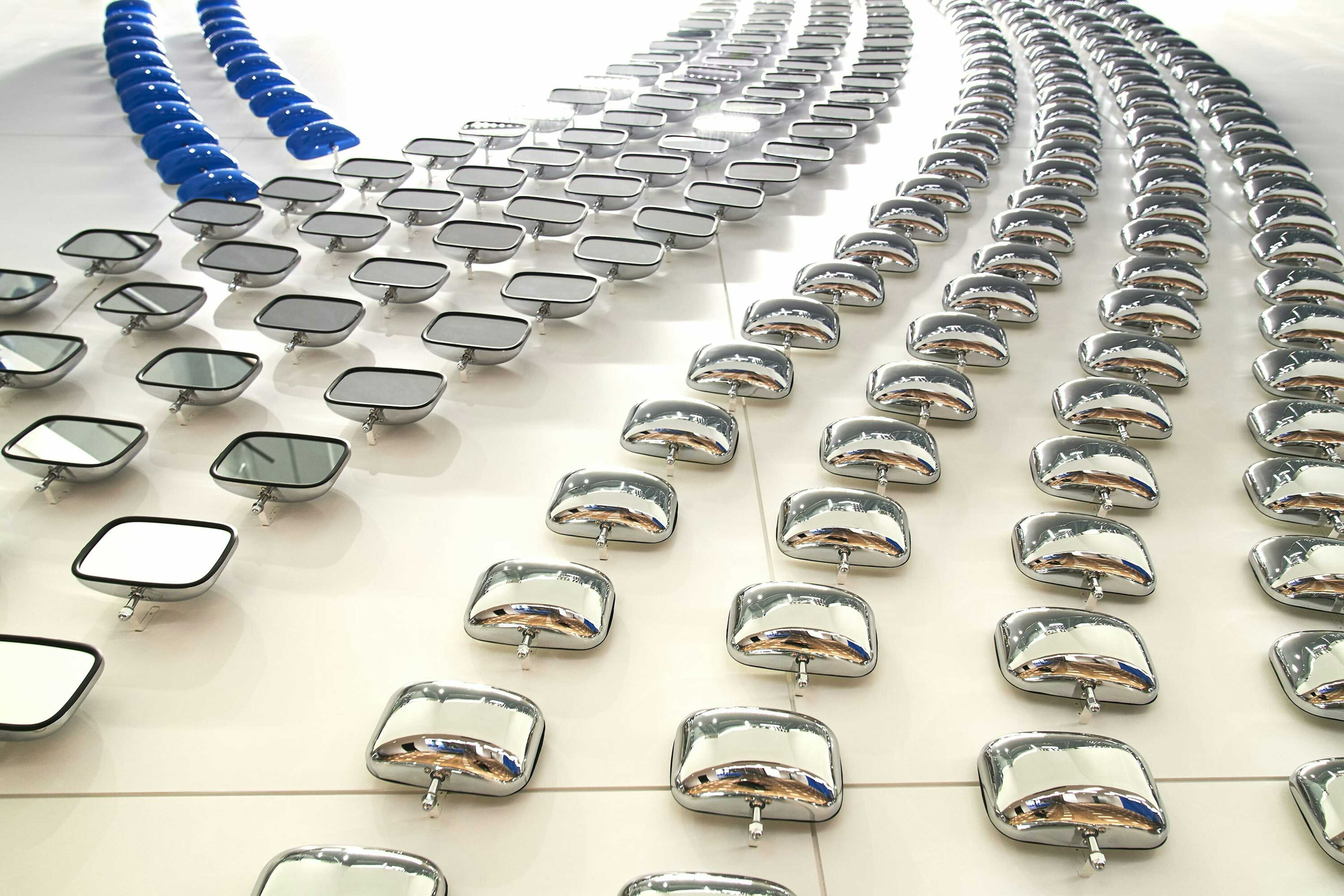
A "freeway" of automobile mirrors reflects the community of Wawanesa's customers.

A "freeway" of automobile mirrors reflects the community of Wawanesa's customers.

We see ourselves reflected within the community of staff and customers.

We see ourselves reflected within the community of staff and customers.

Staff can relax under Wawanesa's "prairie sky" made from colorful seat belt material.

A custom ceiling made from seat belts.
Wawanesa offered us two challenges. First: reduce their total area by half. Second: help staff and visitors better understand the concept of “mutuality,” their auto insurance brand message.
Mutuality is how Wawanesa’s customers own the company and support one another. The office space shows how this relationship is woven together. The “prairie sky” is recreated with 5,000 yards of blue seat belt material woven into the break room ceiling. Another installation of auto mirrors “reflects” the connection between the driver, the company, and the entire community. Wawanesa loves the way the convex mirrors change the perception of the space and the people within it.

A secret space for Leo

A secret space for Leo.

A secret space for Leo.

Recurring themes of intersection and connection are represented with recessed lighting in the walls and ceiling.

Hydraulic operable walls connect the interior to the courtyard.
Hydraulic operable walls connect the interior to the courtyard.

Multiple work settings and places to meet are provided.

Intersecting orange ropes symbolize the connections that Aya's recruiters make every day.

"Connecting the dots" in real time.

Intersecting orange ropes symbolize the connections that Aya's recruiters make every day.

The entire installation is made from a single rope!

Our team collaborated with the contractor to develop the installation details. True teamwork.
Aya Healthcare asked us to install some new workstations into an existing small suite. Over five years of working together, the project expanded into a full-scale transformation of Aya Healthcare’s campus. Spanning three buildings and the outdoor spaces that connect them, the reimagined campus reflects Aya Healthcare’s commitment to fostering a vibrant, people-centric work environment. In a competitive industry where talent is key, their dynamic office and revitalized courtyard provide an inspiring space that supports both productivity and well-being.
Aya Healthcare specializes in recruiting, accrediting, and placing traveling nurses in hospitals across the country. Their recruiters weave complex networks, matching nurses’ skills with the right hospital placements. This intricate process is visually represented through a bold, sculptural installation of orange ropes stretching across walls and ceilings — each rope symbolizing a nurse, and each intersection representing a successful placement. The design captures the energy, dedication, and impact of Aya’s work in a striking, immersive way.
Outside, the transformation continues with a courtyard that replaces former parking and roadways with a sculptural green space. Designed for gathering, relaxation, and large-scale presentations, the courtyard offers a healthy, restorative retreat for employees. Inspired by the life cycle of the lotus flower, three shade structures symbolize its stages — bud, bloom, and seed pod — creating dynamic focal points within the landscape. The spaces between are filled with native plants, offering a variety of settings for sun, shade, group collaboration, and quiet reflection.
The new Aya Healthcare campus is more than an office — it’s an ecosystem designed to inspire, connect, and support the people who make their mission possible.

The demonstration area includes hands-on demos, history displays and a hospitality area with an ocean view.

A circular carpet pattern focuses attention on the displays at the center of the presentation.
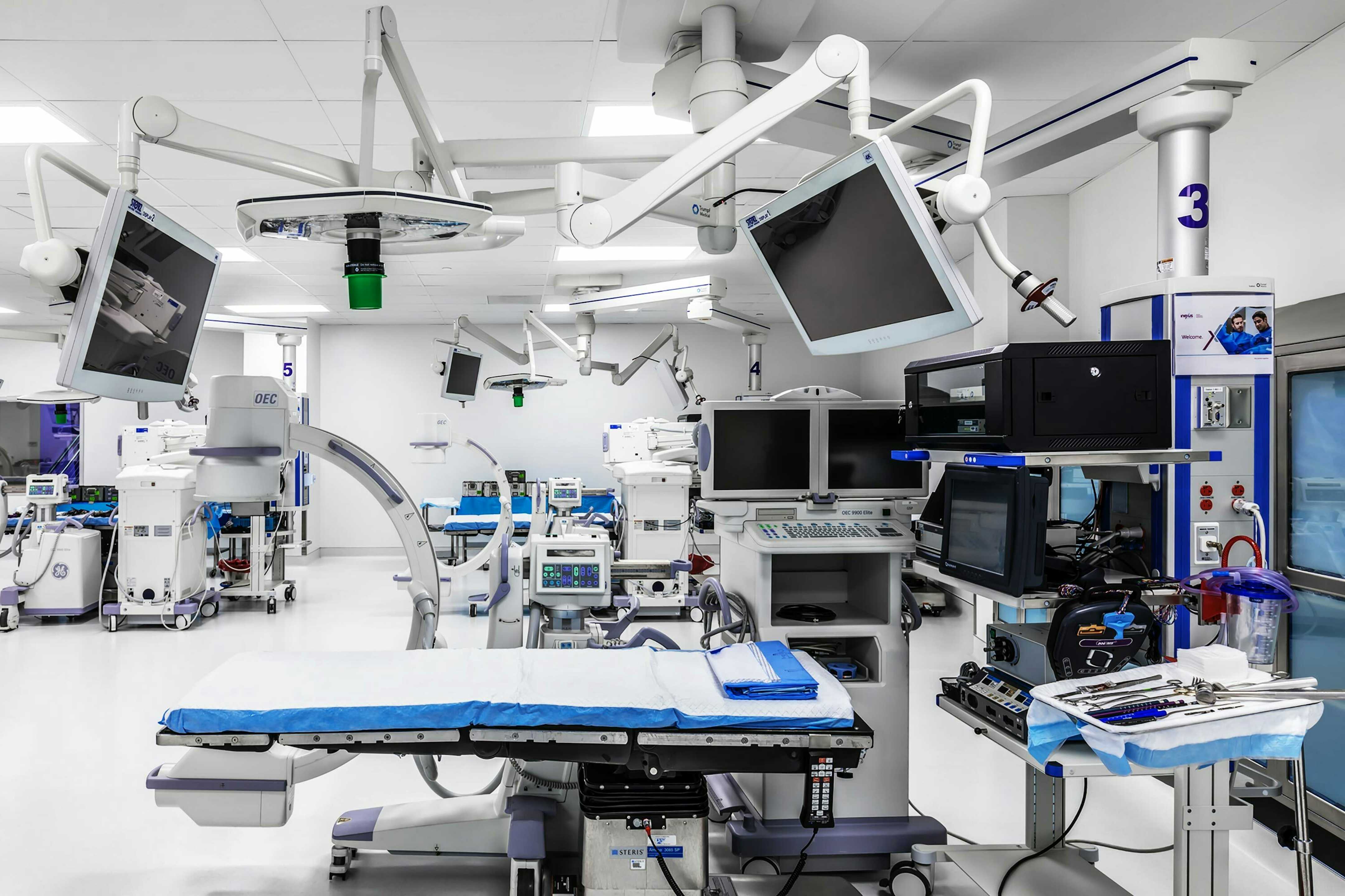
Six fully-functional training ORs demonstrate NuVasive's implants and techniques in a real setting.
NuVasive is the perfect microcosm of what we do: a high-end demonstration area, a super-technical surgery training suite, an operating room, and 100,000 square feet of workstations. The first thing you’ll notice about the demonstration area is how everything revolves around the central hub, all the way down to the circular carpet.
We applied our experience in hospitality to the world of corporate offices to design and custom fabricate 20,000 feet of circular carpet. Without this design decision, the room would not have been as effective or as focused on the central hub.
We also designed a surgery training suite. NuVasive invites surgeons from around the world to visit and train on their products and systems in this space. It is a perfect blend of technology and hospitality. As you can imagine, getting that technology space to work required a tremendous amount of coordination.
For the work area, we were able to redistribute their workstations in such a way that gave them amenity spaces they never had before. We showed them how to get the same number of people into 2⁄3 the space. That gave them 1⁄3 of the area for less programmed space (open meeting areas, lounges, pantries, etc.). We showed them how to do this by making their workspace planning hyper-efficient and then redistributing the leftover space all in one area so they could have a large area we named the “central park.”
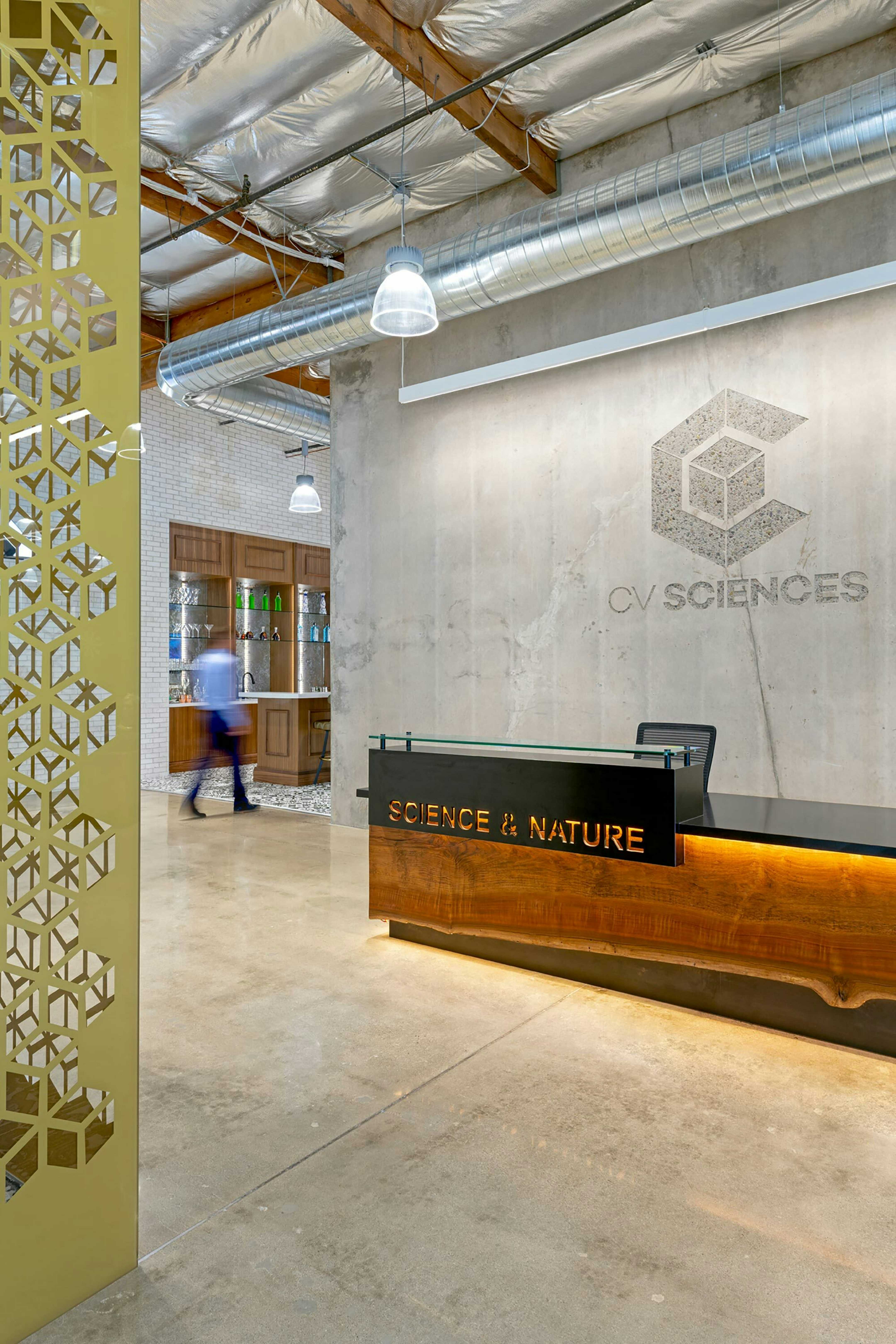
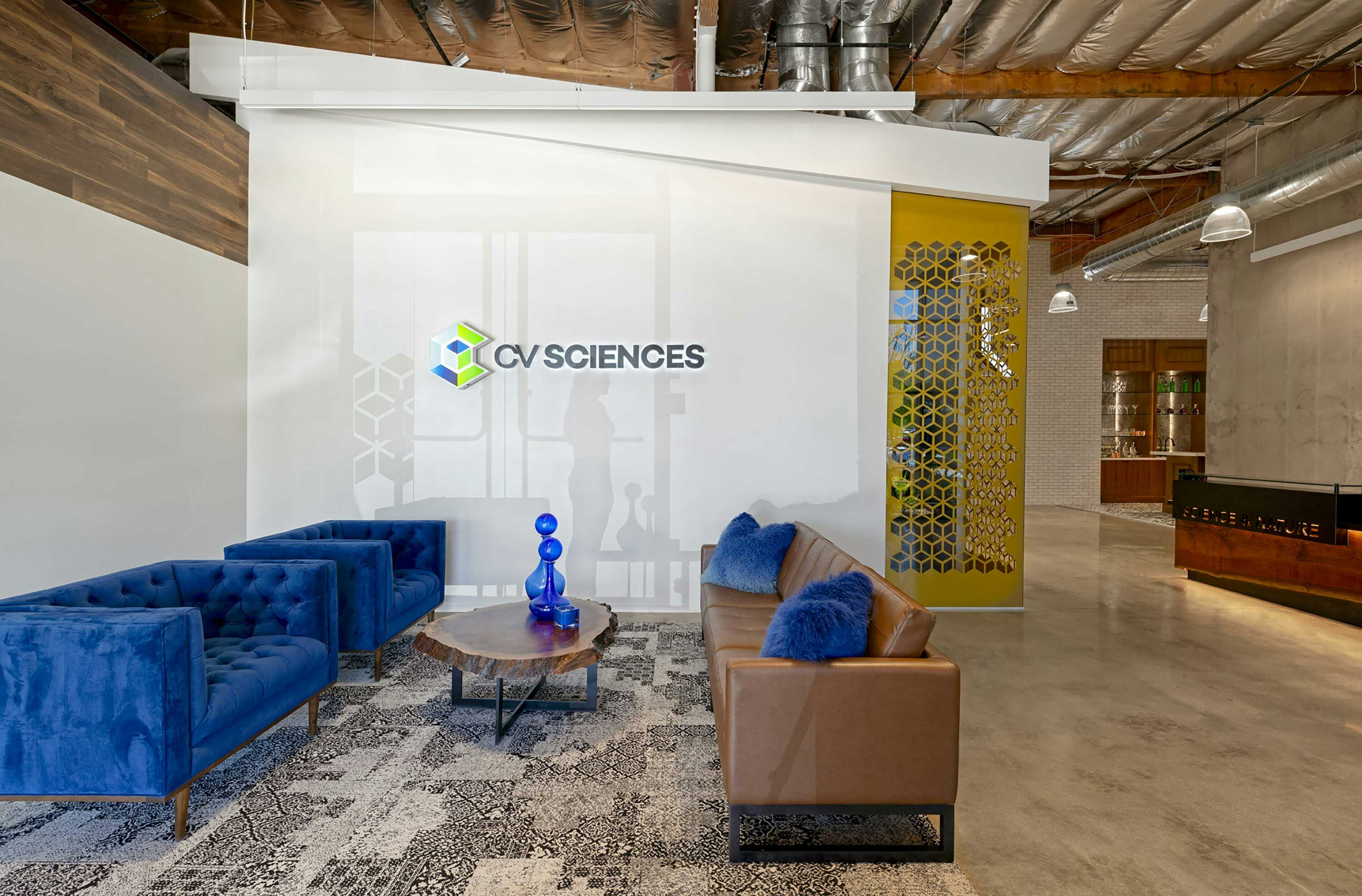
CV Sciences etched into an existing concrete shear wall contrasts with custom gold glass details.
Furniture as blue as Elvis' suede shoes.

Architectural volumes define neighborhoods for various teams.
A recreation of the client's favorite bar brings the teams together.

Fun graphics are inspired by the client's personal collection of rat pack memorabilia.

An impromptu meeting space where staff can collaborate.
Office, lab and warehouse work side by side.

Whimsical graphic wallpaper captures the lighthearted nature of the client.
CV Sciences is a wonderful blend of science and design. In this one space, CBD products are developed, manufactured and marketed. The mix of scientists, artists and sales staff make an interesting mix of function and fun. Teams meet and mingle at the Chicago-style cocktail bar filled with the owner’s collection of rat pack and sports memorabilia. Playful touches abound. Architectural forms float within a large volume to create neighborhoods and separate teams that require quiet from teams that are more energetic.
Light-filled meeting spaces.

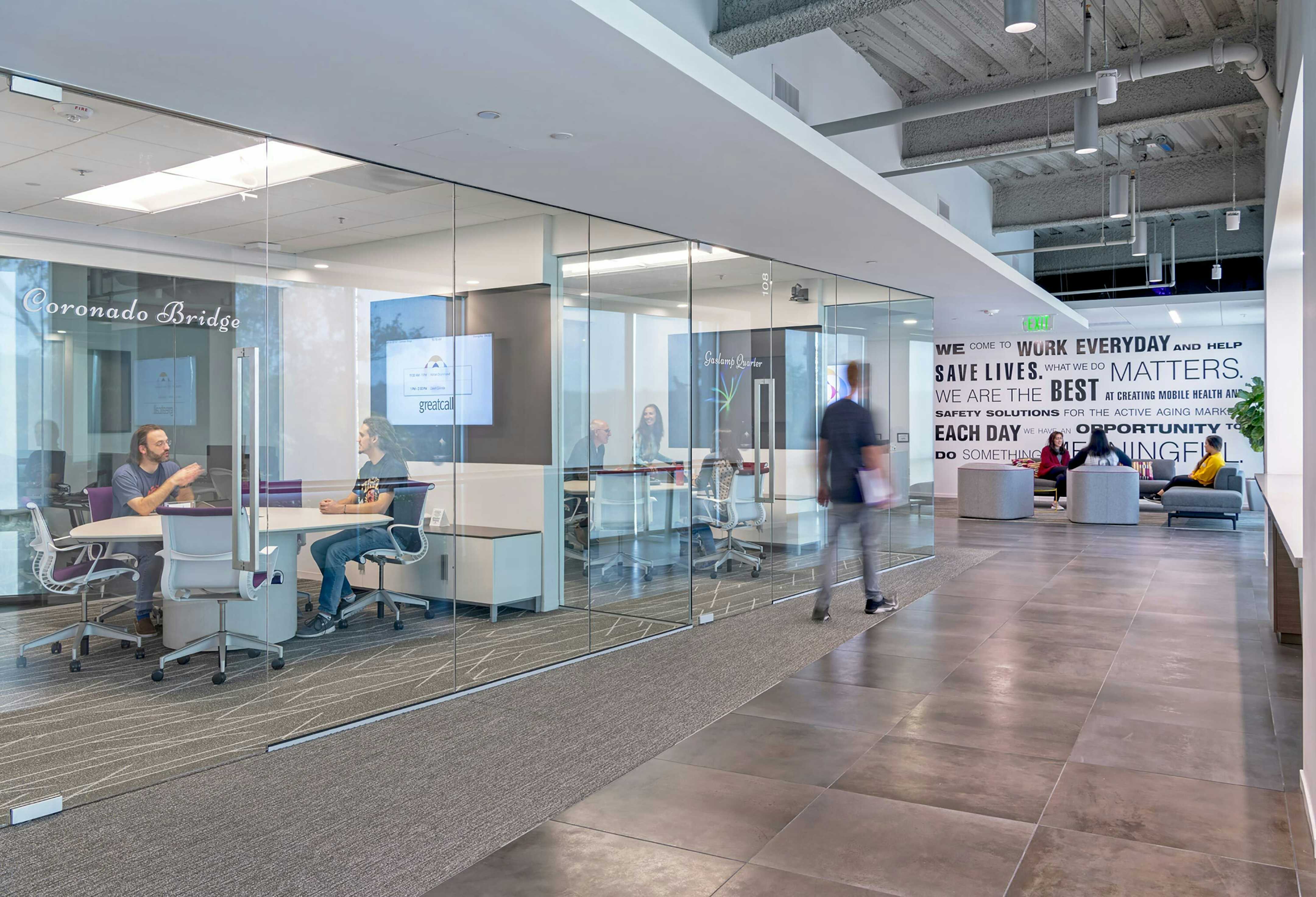
GreatCall provides life-saving products and services to our grandparents. Few tasks are more meaningful than that.
Agile teams are housed in flexible suites that accommodate visitors and foster quick meetings and group work.

Agile team suites provide solo and group work settings.

Hallways are activated with lighting, graphics and nooks to escape into.

Hallways are activated with lighting, graphics and nooks to escape into.
An office with a view and a point of view.
A new folding door system engages a secure outdoor space.
GreatCall designs and markets the Jitterbug smartphone that allows our aging parents and grandparents to live safely on their own with confidence. This corporate headquarters houses their software and hardware engineering teams as well as general administrative functions and a backup 5‑star emergency customer response center.
During focus groups and on-site observations, it became very clear that GreatCall’s standard office environment was working against the needs of their product teams. By reworking the plan to use semi-enclosed suites rather than rows of workstations, GreatCall became the first of its kind for Agile teams.
Agile teams are able to work more effectively, with frequent quick meetings, progress-sharing and the ability to make space for visitors. The semi-openness fosters a sense of connection between teams and displays their unified mission: Let’s do something meaningful together. The new suites layout has helped GreatCall substantially reduce their product development time.

We struck a balance between showroom and workspace. A stage was created to feature new products.

A changing vignettes area is displayed between the fixed stage and ceiling.

3,000 chair casters make a map of BKM's customers.

A map of every San Diego customer is plotted with chair casters.

No contractor was willing to install the caster map... so we did it ourselves! To our surprise, others joined in the fun.

BKM wanted to demonstrate multiple furniture systems and work environments in a compressed space.

Customers and staff blend seamlessly in the work cafe.

Half of the showroom is community space.

A custom bar etched with the latest chair fabric pattern sits in front of 200 3D-printed Think chairs.

A variety of working and meeting spaces allow customers and staff to find exactly the right fit.

A bespoke program of local monument photos is printed on magnetic wall graphics.

Customers can play with materials in a tidy materials library.a
BKM is a local Steelcase dealer. We designed a map of their customers that we plotted onto the wall and ceiling in which each customer is represented by a chair caster.
The graphic is beautiful and fun, but imagine the interaction with the client. You’re a furniture dealer. You just sold a new client. You hand them a caster and a drill and say, “Go put yourself on the map.” Now you’ve created an engagement with that client that’s going to last forever.
After our installation BKM’s business grew by 300%, in part because of their new showroom.

The office entrance is designed to mimic Pirch's retail environments.

Pirch's manifesto consists of 23 elements that are carved into the wall and lit from behind.

The phrase "what if..." drives their business and the design of the space.

There is no receptionist. Instead, a barista offers you a coffee. You are deep in the space and engaging with the team before you realize it.

The new indoor/outdoor space is where lunch is served and guests are welcomed every day.

The new indoor/outdoor space is where lunch is served and guests are welcomed every day.

A custom light fixture inspires action.

Supergraphics remind staff to "play."
Quiet meeting areas are within the workspace.
Glass divider panels double as whiteboards.

Project rooms are customized for each team. The marketing team room is pictured here.
A library is available for anyone who needs a quiet space.

A library is available for anyone who needs a quiet space.

The graphic pattern in the light fixtures is derived from Pirch's logo.

Staff gym and showers provide a spa-like experience.
Staff gym and showers provide a spa-like experience.

A chef prepares breakfast and lunch for the entire staff every day.
A personal trainer encourages staff to use the gym regularly.
Pirch is a lifestyle retailer that celebrates the joy of family and home. They asked us to express the four pillars of their business: kitchen, bath, outdoor, joy. Three of the four are easily represented in an interior headquarters. The fourth — outdoor — was a little harder.
So, part of our design was to remove 14 parking spaces and open up the side of the building so that they would have an indoor-outdoor workspace that is connected to the “outdoor” pillar of their business.
We felt it was incredibly important that they incorporate this into their space because it reflects who they are as a retailer and is integral to their business. The two decision makers went away for the weekend and battled it out. In the end, they came back and said, “Okay, we’re going to spend the extra money, but I hope it’s worth it.” We knew it was important, and we knew that it would be game-changing for them.
When it was all said and done, they said it was the best money they had ever spent. They use this space regularly — it became the center of their daily rituals.
We also reconsidered what their reception experience should be and placed a coffee bar where you would expect to see a receptionist’s desk. This turned the whole experience of entering an office on its head. Instead of a receptionist saying, “Whoa, whoa, whoa, you’re not allowed past here until you’ve signed in,” you’re offered a cup of coffee. And by the time you are in the space for a few minutes, you are immersed in their culture.
The new headquarters brought the team together in a way that allowed Pirch to build 10 new stores in the first year.
Soft waves and sandy colors echo the mountains and beaches of San Diego.

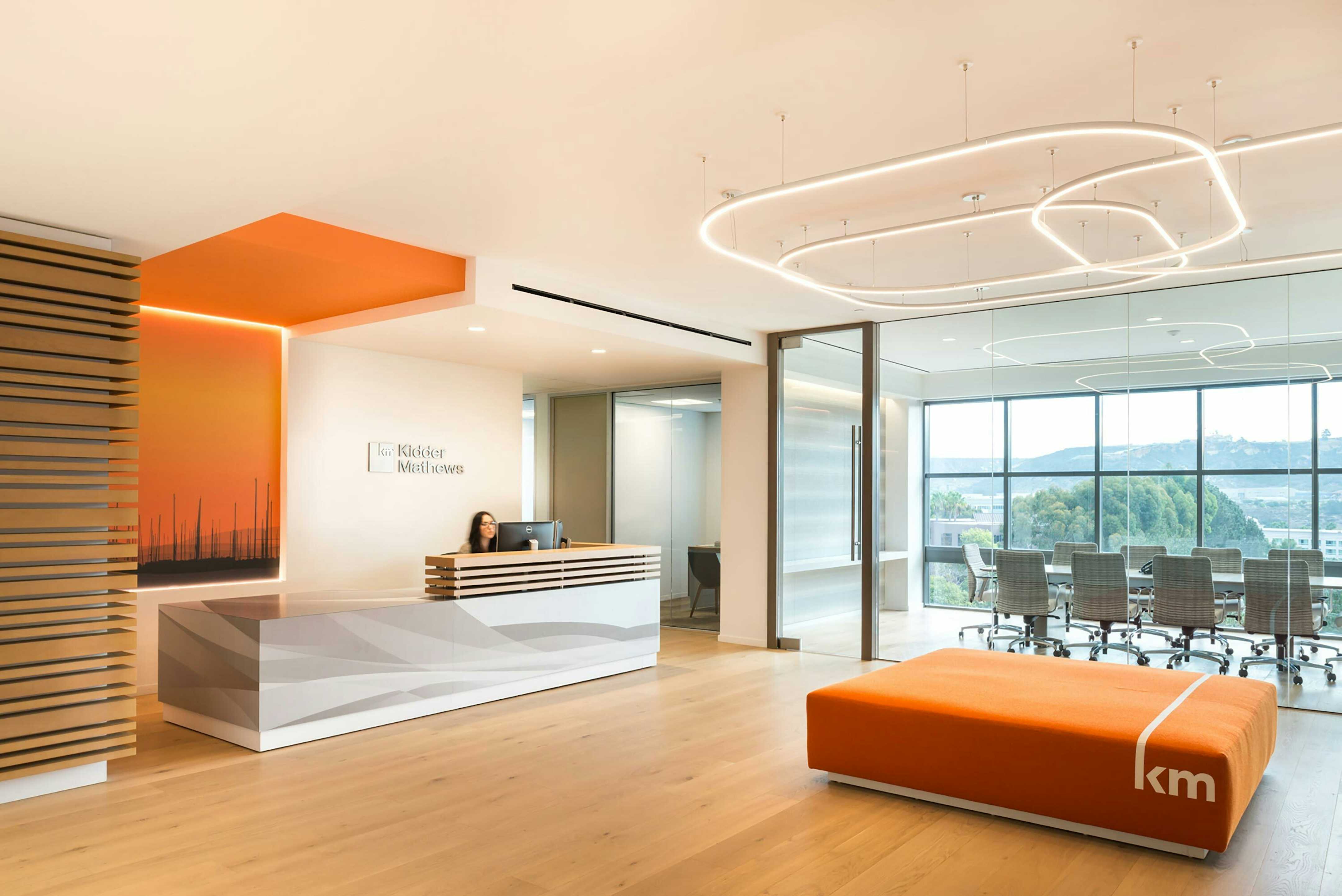
Kidder Mathews' logo is reinterpreted as a piece of furniture for their lobby.

A custom graphic wall covering shows local icons against a sunset of Kidder Mathews' logo color.

Glass office fronts encourage interaction between brokers.

The Los Angeles office is branded to represent the downtown vibe.

Maps without names represent brokers' knowledge of the neighborhoods of LA.
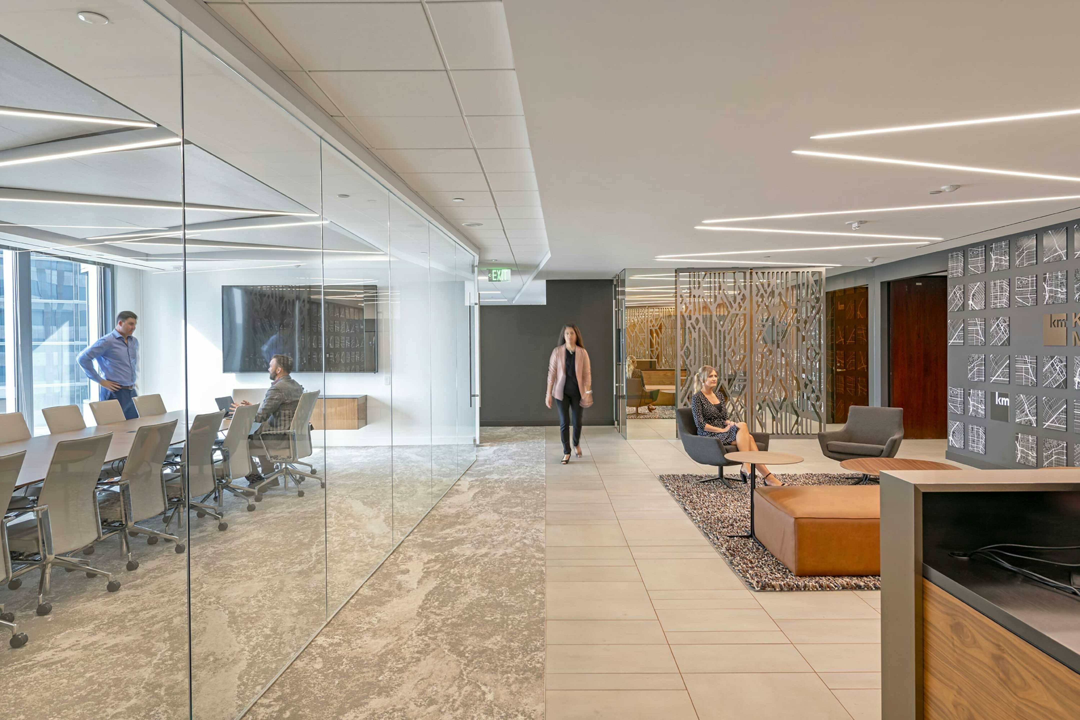
One-way glass around the breakroom provides privacy and visually extends the lobby.
Kidder Mathews didn’t tell us in the design brief that brokers hang out out in the doorways of their offices. But we observed it happening regularly. Someone would stop by, but they wouldn’t quite go in because they didn’t want to interrupt. So they would stand in the doorway for a moment to talk. We asked ourselves, “How do you reinforce that behavior in a way that makes the company better?”
Our answer: use glass office fronts and wider door frames to facilitate these casual interactions. Move desks forward and closer to the door so that these discussions can be more direct. And have monitor arms that can spin 180°.
We developed five offices across the Southwest for Kidder Mathews. Each office has its own personality within the larger corporate standard. Featured graphics focus on the brokers’ in-depth knowledge of their market. In the downtown Los Angeles office, a series of street maps visualize the various neighborhoods represented. The brokers don’t need street names to read the maps because of how well they know the area. Colors and finishes are tailored to each location within an overarching color palette — San Diego and Phoenix are brighter; the Los Angeles office is a little deeper.
Get an overview of our unique approach.
Learn more about our process.
Get in touch.